the COMPANY:
McGregor Coxall is an internationally renowned, multi-disciplinary design studio specialising in Biourbanism, Environmental Engineering, Landscape Architecture, and Urban Design. The studio is dedicated to crafting resilient cities and environments that contribute to a sustainable and prosperous future.
THE PROJECT:
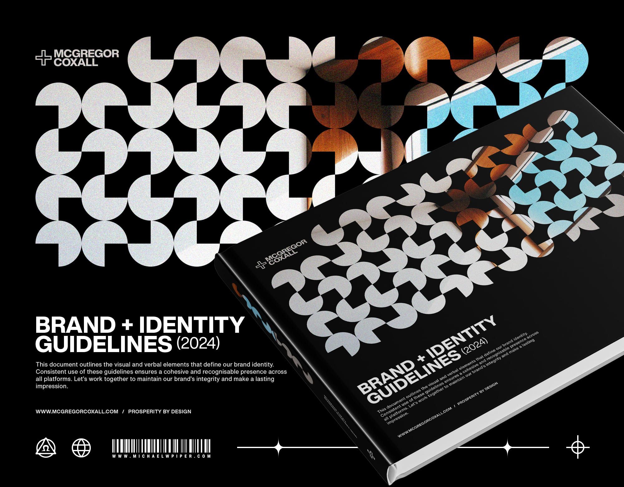
The goal was to design a series of informed web layouts, motion graphics, and bespoke UI elements to enhance MCGC's existing and future online collateral, aligning with the 2024 branding and identity guidelines. Given the project's scale, which encompasses 20 years of past work and future developments, my role was to define the website's look and feel through layout and motion graphics. This process allowed each section to be developed and approved by the board before we approached a web developer to manage the extensive reformatting work.
Here we explore a range of fully custom, minimal yet dynamic UI elements that enhance content and user experience while effectively representing the company’s new branding. These elements include a branded hamburger menu, day/night mode buttons, and a Discipline switch filter system to customise the viewing experience according to consumer preferences.
Next, we examine the application of the revised web pages—Disciplines, Projects, News, Team, and Profiles—which constitute the bulk of the content to be redeveloped. We introduce a range of custom web components, including menu navigation, full-bleed video, enticing call to actions and multiple taxonomy and carousel designs for projects, news, and team profiles. Through motion graphics, we can conceptualise the interactive features between users and the UX elements on each page.
Note: For file size and display purposes, all motion features are on a small loop. Please take a moment to pause on each section to fully experience the vision.


